Appingine
Let's Discuss Your Tech Solutions

Camilla Lawrance

 07/16/2026
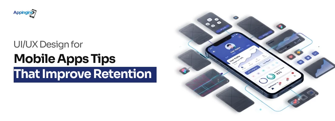
Having an app idea and developing it is not enough for the business, but while developing the app, the very important thing to keep in mind is what increases its retention.
Why do some apps become part of our routine while others are deleted within minutes? Let's suppose someone downloads your app, opens it once, goes around for ninety seconds and never comes back. It actually happens with the majority of apps, but it doesn't really mean that the idea was bad. It's the tiny moments of confusion, delay, or annoyance — the friction — that quietly convince someone to hit delete.
Let's see what market statistics have to say about this, though. The average mobile app loses 77% of its daily active users within the first three days after downloading it. By day 30, that percentage rises to 90%. That isn't a product or marketing issue. It's a UX issue.
Well, retention isn't won with a flashy splash screen or a clever logo. It's won in the details — how fast someone understands what to do next, how forgiving the app is when they slip up, and how good it simply feels to use. In a market where users decide whether to keep an app within the first few minutes, UI/UX isn't a finishing touch. It's the product.
So what actually keeps people coming back? Let's break down the design principles that separate apps people love from apps people forget they ever installed.
The UX design of mobile apps is impacted by page load speed. According to Google's UI UX research, if an app or website takes more than three seconds to load, there might be a chance of losing 53% of mobile users in one go. This means that more than half of your audience may leave before they see a single piece of information.
Performance is an essential component of the user experience, not only a technical issue left to developers after the design stage. Speed is one of the crucial components of user satisfaction and retention since every UI design choice which affects how quickly an app feels and responds.
The fix begins with the design file, not the codebase. Design lean, then build it.
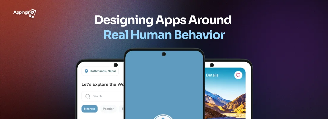
What is the thumb zone in mobile user experience design? The thumb zone is the area of a mobile screen that a user can easily access with one hand. According to UI UX research, things placed in the natural thumb reach zone, which is often the bottom two-thirds of the screen, receive 80% more interaction than those placed higher up.
Most developers and designers still create mobile layouts with a mouse on a desktop screen. As a result, primary actions are located at the top of the screen, where thumbs cannot easily reach and users must stretch or swap hands to tap the item.
Best practices for thumb-friendly mobile user interfaces:
How does the onboarding UX impact mobile app retention? It's usually the decisive element. Apps with effective onboarding can boost user retention by as much as 50%. Additionally, most apps squander this chance by adding a ton of features, permission requests, and configurations before the user has experienced a single moment of benefit.
What it looks like in practice:
The best example of this done correctly is Duolingo. Within the first minute of using the app, users are immersed in a real lecture, and its usefulness is apparent even before creating an account.
What constitutes a good user experience for mobile app navigation? when users don't ever need to consider where to go. You've already caused friction when a user takes a moment to find out how to utilize your software.
According to a 2025 arXiv study on UX design and mobile retention, customers give up and uninstall apps with poor navigation—not because they don't have functions, but rather because it's difficult to find those features.
Keep navigation straightforward and honest:
Also, you can read iOS vs Android to learn key differences between both.
Why are error messages in mobile apps important for user experience? Because the final thing a user sees before uninstalling is frequently an unclear error notice at a crucial point, such as when making a purchase, logging in, or submitting a form.
Error handling without a clear message is nothing. It's one of the main reasons why 62% of consumers quit programs because of a bad user experience. Ensure you provide error messages in your UI UX design that clearly explain what went wrong and how to resolve it for users.

Monitor your retention rate on Day 7. The UX is losing consumers before they develop a habit if less than 20% of them come back on day seven. This figure is directly impacted by all five of the aforementioned practices.
Making things appear flawless on a mockup is not the goal of mobile UX design. It's about ensuring that actual users on actual devices—like one hand on a moving train—can always quickly and smoothly access what they're looking for.
Great mobile apps don't earn loyalty by looking impressive but they earn it by making every interaction effortless. The combination of fast load times and thumb-friendly layouts and even streamlined onboarding, intuitive navigation and helpful error handling create every UI UX design decision influences whether users stay or leave.
In a competitive market, according to the UI UX research, most apps lose the majority of their users within the first month but retention is built through consistent, friction-free experiences rather than feature lists or visual polish alone.
By putting users first at every stage of the UI design process, businesses can create mobile apps that not only attract downloads but also become products people return to and rely on over time.

Tel: +1 (800) 453-1297
Email: [email protected]
Main Office:
4929 Wilshire Blvd, Los Angeles, CA 90010
© 2026 Appingine. All Rights Reserved.